Recall back to your childhood when you were dressed without any concerns of your input as to what you were wearing. Thinking about It, may seem too elementary but the role of color holds huge importance in the realm of fashion. The vibrancy or opaque tones instantaneously pull us in; sometimes more than the actual collectiveness of an outfit. Here, I’m going to layout the essential understanding of the color theory/color harmony and how you can use it to benefit you while also manipulating it.
The Color Wheel
In the world of visual arts, the color theory is a body of practical guidance to comprehending the concept of color mixing and along with visual effects of a specific color combination(s). Within this concept there are also definitions or what are also known as categories to be of colors based on the color wheel spliced into three categories: primary color, secondary color, and tertiary color. The primary circle based on the colors red, yellow and blue are the colors that cannot mixed or formed by any other combination of colors. Additionally, you have green, orange and purple as your secondary colors and hybrids of the primary and secondary colors as what we know as tertiary colors.

Color Harmony
Next, the concept of harmony surrounding colors is vital to understanding visual appeals. Harmony in relation to color among other other things, brings a feeling of collectiveness and overall allows one to better digest mentally and aesthetically what they see visually. When color harmonize it helps establish orderliness and dispels and notions of chaos or imbalance. Furthermore, from a psychological standpoint an overabundance or underwhelming amount of harmony can lead to over/under-stimulation; Moreover, moving further away from the idea of dynamic equilibrium.
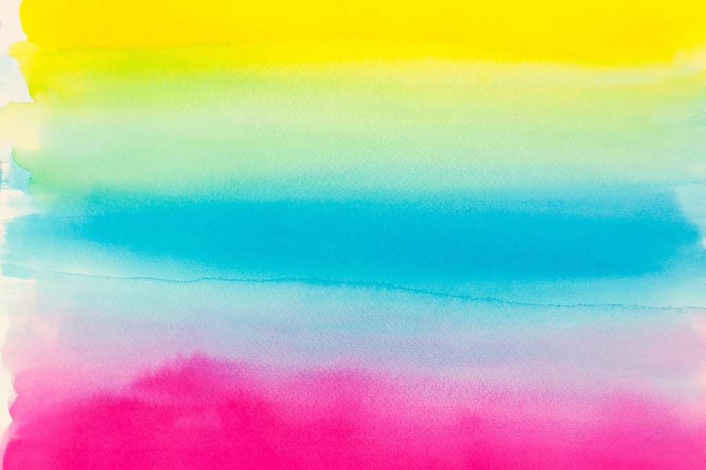
Withal, this ideal gives us color schemes. Color schemes can be analogous which are colors that are side by side along the color wheel, such as blue-green or blueish-purple. Comparatively, there are also complementary colors which are colors that are diagonal in retrospect to the color wheel; for example how well the colors yellow and blue go together or orange and green for that matter. As mentioned in my previous post, providing color schemes are essential tools in aiding the culmination of your own stylistic approach.
Color in Context
The world of fashion has moved from a hands on industry to one with more digital applications of designing and styling than ever before. Different fabrics and textures expand on the complexity of transferring some of those digital properties into tangible products. Think about a time when you purchased an item online and the stock photo didn’t match what came in the package. The content of colors digitally don’t always translate the best. Apart from that it can be even more of a challenge tailoring a look together when the colors are off. Below I’m going to through a time I ran into an issue of this nature.
Below is a photoshoot I took from my past birthday. Alike my previous post on high-low looks, I followed a similar method in piecing my outfit together. I narrowed in on the factor of me getting new shoes and centered the look aesthetically around this abstract yet simple color scheme. My first color scheme was rooted from the blue-green color of the shoes and find materials that would flow well with my shoes.
